Over the past few days, me and my client started to work on my Contact Us page, and looked at some other pages for ideas. When going through previous blog posts on existing solutions, we found the "Xava Interiors" contact us page to be rather interesting. The emphasis on the maps and the address details on the bottom gives the user a clearer view of the map location.
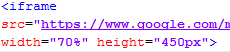
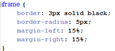
In order to emulate this, we changed the height/width of some things in the code. For the iframe (google maps), We set the width to 70% (the exact size will change according to the monitor size, or pixel of monitor the user views it on. However, it will always take up 70% of the width of screen in the browser). Also, We set the margin for left/right to be both 15%, therefore centering the iframe. It also makes sure that it is the only content in the row, excluding things set as position:absolute.
Using the webpage
http://www.xavainteriors.hk/contact.html as inspiration (as mentioned above), the address details will be put at the bottom of the iframe. I used similar width attributes for the address details to the iframe, changed the font and word sizes, and border settings.

The font I used was 'trajan pro', or 'times new roman' if the user didn't have that font installed. I changed the font size to 13px and the letter spacing as 2px, to make sure it doesn't jumble up. The height is set as 230px so that it can accomodate all the text. For the width, and margins, I set it to the exact ones used for the iframe. I also only set a border for the top side, because I discussed with my client to not use a border. Instead, the top border is used as a line for the address title, as seen here:
For each paragraph that separates the different address details, I also changed the margins for them so that the distance between them has been reduced.
For the title of the address (Contact details), I used <center> to create the title. Here is the HTML and CSS code:
This makes sure that the words will be in the center of the row, and won't be placed on the left or right.

The title uses the same font as the address details, with a grey color. The margin for top is to make sure it doesnt stay too close to the iframe, and make it look too 'squished'. Me and my client decided to use 5px for letter spacing because we agreed it looks best after experimenting with different pixels for letter spacing.
After doing all the modifications that enlarged various parts of the webpage, we realized that the side buttons for social media looked too small in comparison to the website. Therefore, we looked at modifying the sizes of the buttons, and their spacing. The old size for the buttons were 90px * 90px, but I changed them to 100px * 100px, and also they have 80px between each one using margin-bottom for the top 3 buttons.

We only used margin-bottom for the first 3 buttons, because me and my client only want the buttons themselves to have 80px between them. If we set the bottom button to also have 80px underneath it, it will create unnecessary space underneath it.
We also moved the buttons down more, by changing the position:absolute top from 100px to 150px. This way, it also reduces the 'squished' look.
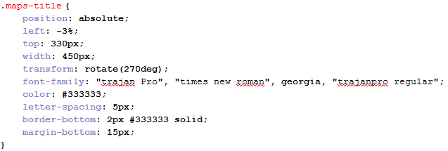
Finally, we also created a title for google maps. To make the website look better and make use of the extra space, we decided to make the title flip sideways so that its on the left side of the google map iframe. At first, we decided to do this by using an image. However, my client decided against this because it would be difficult to edit the text. At first, I didn't know how to do this, so I found a tutorial on the internet that would teach me to flip text on CSS (
http://davidwalsh.name/css-vertical-text). It teaches me to use "transform" attribute to flip the text.
The transform attribute tells the text to rotate a certain degree, and the transform-origin tells us how to rotate the page.
We used this to help me with creating the title. First of all, We created a <div> for the title which was put in <center> tags:
For the CSS, I used the code that was in the tutorial:
Because the transform is done in the middle of the <div>, We needed to use "left: -3%" so that it would be placed alongside the iframe. The same goes for the "top: 330px". It's width is set as 450px, which is the height of the iframe so it can be aligned with it. The rest of the attributes are copied from the title for the address details.
After this, we finally completed our webpage for "contact us". Here is what it looks like now (top and bottom, since my monitor cannot see the whole webpage without scrolling):
Now that we have finished making this webpage, I will discuss with my client using email for modifying the final webpages to finish our website modification.


