The footer has an "Â" at the start of it, even though I didn't type that into the code. After searching on the internet, we realized that it was because we forgot to add a small line of code into the html file. The code is "<meta charset="utf-8">". This removes the "Â" in the footer because the browser now knows the webpage is in UTF-8, not ASCII by adding this line of code inside the <head> of the HTML file. After adding this line of code, here is what the footer looks like:
Another think that we realized when we uploaded the images, was that they would take some time to load. We first thought that it was because of the size of the images, and I used Photoshop to reduce the size of the images.

Using the "Save for web" function in Photoshop, I was able to reduce the size of the photos, while sacrificing some of the quality.

However, after I reduced the size of the photos, the problem still persisted because of the limitations of using a free hosting site (limited bandwidth). Therefore, we decided to leave this because my client would rather sacrifice loading time to make sure that the images were displayed clearly for the user to see, and if we used lower quality images it would mean that we are sacrificing visual appeal which was an objective when we created the website.
On the 11th of February, I went to my client's office to hand over the website and do a demonstration of the functions that we made on the website. We believed that if I went over to present the website instead of doing it via e-mail, it would be a better method to present it to my client in case she had any queries or questions while doing it.
During the handover, I showed my client the website, talking through the different webpages and how it meets with our objectives. I also recorded a video of the handover between me and my client.
Here is the transcript of the handover:
HOMEPAGE
Me: Hello, so here is the website we have. Right now you're looking at the homepage, which contains the image gallery, and small image thumbanails on the bottom. It also contains the navigation bar that is used on every webpage in our website. The monochromatic theme is used for the whole website that we agreed on, to create simplicity but retain elegance.
Client: That's great. could you talk me through the thumbnails and the gallery?
Me: Definitely. For the gallery, the pictures can be scrolled through either using the arrows on the sides, or using the buttons on the bottom. Using a cubic bezier curve, we were able to make the sliding animation change speeds, and also create a better visual appeal which was an objective we set. The gallery and the thumbnails were added to satisfy the objective that we set about providing information such as pictures, to your clients.
Client: Good. I remember around December you were asking for modifications on the webpage. How did that help us improve the webpage and meet the success criteria?
Me: That helps us to meet the visual appeal objective criteria. The prototype webpage had a single color background with considerably smaller pictures. The whole webpage was reworked to give a monochromatic fading background, with a bigger image gallery and thumbnails. A title was also added for the thumbnails so that the clients understand what it is for, and avoid confusion.
Client: I see. Great work on this. I really enjoy the style on the webpage.
ABOUT US
Client: So for this website, could you tell me how you decided to modify it and how it meets the objectives?
Me: Seeing that this webpage was the simplest out of all our webpages, there was actually very little we could do to modify the webpage. Using the principles we based our modification from on the homepage, I incorporated that into our webpage. Apart from the general modifications that were used in the homepage such as navigation bar, titles and background, I enlarged the size of the text box and rounded the picture edge on the page to increase the visual appeal, which was again, the main point of the modification since the website lacked visual appeal.
Client: Thats great! Good job on the modification, after looking at the previous version, I have to agree that it is much better after we modified it. What caught my attention was also the navigation bar, how did you modify that?
Me: After looking at some existing websites on design companies, I saw that they really provided an emphasis on the logo compared to the prototype website. using that, I enlarged the navigation bar because it contains the logo, and we enlarged the logo.
Client; I see. So for this webpage, it was designed to inform the user about my company right?
Me: Yes, the website was made to tell the user about your company, and give them an idea on what your company does. The text box can be scrolled through if the text doesn't fit the box, so that it won't ruin the webpage structure when you need to update the description and there is alot of text.
Client: Great. I'm really happy with the design layout and the rounded picture edge. I think that looks good and really helps to improve the visual appeal. I think that the scrolling text box was also a great modification to the website as well.
CONTACT US
Me: For this webpage, the main idea was to provide contact methods for the user to your company, and also give a precise location for the user to know where the office is located. This fits with the success criteria that we made, which is to provide details on contacting the company while making sure it is easy to be accessed.
Client: That's very good. It's good to know that you're following the success criteria closely with each webpage, so that every webpage definitely fits well with the success criteria. What in this webpage did you previously modify?
Me: The text font, color and sizes were modified to increase visual appeal. In order to save space but also retain the minimalism characteristic, I created a vertical title for the google maps widget.
Client: It's a very effective and interesting idea. How did you eventually come up with this?
Me: Well, I first looked at what space was unused in the webpage, and I saw that the sides of the webpage was neglected. What I did to compensate for that was to use it by implementing a vertical title. To achieve this, I first tried to make the title as an image file, but decided against it since it would be troublesome to edit the title if needed. Instead, using CSS to rotate the title I was able to create the vertical title.
INTERIOR/EXTERIOR
Me: For the final webpage, it was really down to creating a simple layout to display the images which would satisfy our final point in the success criteria, that is to provide project information by using pictures. The simply layout was the best way to display these images and make sure the user can find them easily.
Client: I really like this design as well. I'm not a big fan of fancy designs and this was something that I had in mind to create. Thank you for coming over to hand over the product.
Me: No problem, it was a pleasure.
With the video clips recorded, I combined the video clips using Sony Vegas. Afterwards, I rendered the video as a 720p wmv file.
 - This is a screenshot of Sony Vegas, when I was rendering the final handover video.
Finally for future developments, me and my client are considering the possibility of creating webpage for the pictures on the website instead of a link, since the webpage can also provide information about the image such as a brief introduction, and designers involved with the project.
On the 11th of February, I went to my client's office to hand over the website and do a demonstration of the functions that we made on the website. We believed that if I went over to present the website instead of doing it via e-mail, it would be a better method to present it to my client in case she had any queries or questions while doing it.
During the handover, I showed my client the website, talking through the different webpages and how it meets with our objectives. I also recorded a video of the handover between me and my client.
Here is the transcript of the handover:
HOMEPAGE
Me: Hello, so here is the website we have. Right now you're looking at the homepage, which contains the image gallery, and small image thumbanails on the bottom. It also contains the navigation bar that is used on every webpage in our website. The monochromatic theme is used for the whole website that we agreed on, to create simplicity but retain elegance.
Client: That's great. could you talk me through the thumbnails and the gallery?
Me: Definitely. For the gallery, the pictures can be scrolled through either using the arrows on the sides, or using the buttons on the bottom. Using a cubic bezier curve, we were able to make the sliding animation change speeds, and also create a better visual appeal which was an objective we set. The gallery and the thumbnails were added to satisfy the objective that we set about providing information such as pictures, to your clients.
Client: Good. I remember around December you were asking for modifications on the webpage. How did that help us improve the webpage and meet the success criteria?
Me: That helps us to meet the visual appeal objective criteria. The prototype webpage had a single color background with considerably smaller pictures. The whole webpage was reworked to give a monochromatic fading background, with a bigger image gallery and thumbnails. A title was also added for the thumbnails so that the clients understand what it is for, and avoid confusion.
Client: I see. Great work on this. I really enjoy the style on the webpage.
ABOUT US
Client: So for this website, could you tell me how you decided to modify it and how it meets the objectives?
Me: Seeing that this webpage was the simplest out of all our webpages, there was actually very little we could do to modify the webpage. Using the principles we based our modification from on the homepage, I incorporated that into our webpage. Apart from the general modifications that were used in the homepage such as navigation bar, titles and background, I enlarged the size of the text box and rounded the picture edge on the page to increase the visual appeal, which was again, the main point of the modification since the website lacked visual appeal.
Client: Thats great! Good job on the modification, after looking at the previous version, I have to agree that it is much better after we modified it. What caught my attention was also the navigation bar, how did you modify that?
Me: After looking at some existing websites on design companies, I saw that they really provided an emphasis on the logo compared to the prototype website. using that, I enlarged the navigation bar because it contains the logo, and we enlarged the logo.
Client; I see. So for this webpage, it was designed to inform the user about my company right?
Me: Yes, the website was made to tell the user about your company, and give them an idea on what your company does. The text box can be scrolled through if the text doesn't fit the box, so that it won't ruin the webpage structure when you need to update the description and there is alot of text.
Client: Great. I'm really happy with the design layout and the rounded picture edge. I think that looks good and really helps to improve the visual appeal. I think that the scrolling text box was also a great modification to the website as well.
CONTACT US
Me: For this webpage, the main idea was to provide contact methods for the user to your company, and also give a precise location for the user to know where the office is located. This fits with the success criteria that we made, which is to provide details on contacting the company while making sure it is easy to be accessed.
Client: That's very good. It's good to know that you're following the success criteria closely with each webpage, so that every webpage definitely fits well with the success criteria. What in this webpage did you previously modify?
Me: The text font, color and sizes were modified to increase visual appeal. In order to save space but also retain the minimalism characteristic, I created a vertical title for the google maps widget.
Client: It's a very effective and interesting idea. How did you eventually come up with this?
Me: Well, I first looked at what space was unused in the webpage, and I saw that the sides of the webpage was neglected. What I did to compensate for that was to use it by implementing a vertical title. To achieve this, I first tried to make the title as an image file, but decided against it since it would be troublesome to edit the title if needed. Instead, using CSS to rotate the title I was able to create the vertical title.
INTERIOR/EXTERIOR
Me: For the final webpage, it was really down to creating a simple layout to display the images which would satisfy our final point in the success criteria, that is to provide project information by using pictures. The simply layout was the best way to display these images and make sure the user can find them easily.
Client: I really like this design as well. I'm not a big fan of fancy designs and this was something that I had in mind to create. Thank you for coming over to hand over the product.
Me: No problem, it was a pleasure.
With the video clips recorded, I combined the video clips using Sony Vegas. Afterwards, I rendered the video as a 720p wmv file.
Finally for future developments, me and my client are considering the possibility of creating webpage for the pictures on the website instead of a link, since the webpage can also provide information about the image such as a brief introduction, and designers involved with the project.


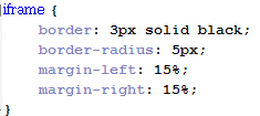
 The font I used was 'trajan pro', or 'times new roman' if the user didn't have that font installed. I changed the font size to 13px and the letter spacing as 2px, to make sure it doesn't jumble up. The height is set as 230px so that it can accomodate all the text. For the width, and margins, I set it to the exact ones used for the iframe. I also only set a border for the top side, because I discussed with my client to not use a border. Instead, the top border is used as a line for the address title, as seen here:
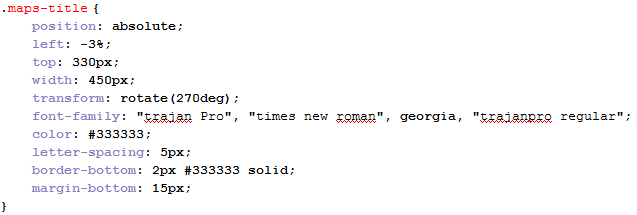
 The title uses the same font as the address details, with a grey color. The margin for top is to make sure it doesnt stay too close to the iframe, and make it look too 'squished'. Me and my client decided to use 5px for letter spacing because we agreed it looks best after experimenting with different pixels for letter spacing.
 We only used margin-bottom for the first 3 buttons, because me and my client only want the buttons themselves to have 80px between them. If we set the bottom button to also have 80px underneath it, it will create unnecessary space underneath it.


