Friday, October 24, 2014

Oct 24 - Design Making #4

Due to CAS Week, I have not been able to complete my final design. However, over half-term, I have started to create my final design and complete it:

In this design, I used the horizontal menu bar and also used a scrolling design for the main articles (along with less important ones at the bottom). The use of this would provide more space for different articles, but however, this could mean that some articles might be missed by the user if they do not scroll onto all of them. This design provides much flexibility out of all since more articles can be added or removed.


For the contact us page, I decided to make 4 equal boxes for 2 social media widgets, 1 Google Maps widget, and 1 for text details of the office. The 3 mini transparent boxes are for social media website links, without widgets. I think this design is a more simple, organised design compared to the other ones.

Thursday, October 9, 2014

Oct 9 - Design Making #3


My third design has been completed for my client, and I have made many visual changes to this design:

For the homepage, I have moved the menu bar to a horizontal position, and instead gave it 5 main articles for the homepage. I used the Comodo Design webpage as inspiration for the menu bar, as it could be a better option for my client. The 5 articles have been made so that efficient use of space can be achieved if there is not much text to show for them. The 2 articles that are on the left are bigger so that the important info can be easily shown on there. The 3 articles on the right are smaller as less important information can be shown there.
The contact us page for this design is a mix of the first and second designs, which shows efficient use of space while lacking visual appeal. The social media links have been aligned horizontally on the right, while the text details for the office and the Google Maps widget have been elongated.

Thursday, October 2, 2014

Oct 2 - Design Making #2

Today, I have finished the second website design idea for my client's company. This design provides slight changes to my first design in some aspects such as the menu bar, but also some major changes in other areas:
For this design, I changed the horizontal menu bar to cover the whole top part of the screen, and was also moved the logo on top as well. I think this might provide a variety of designs, and my client can use some aspects of each design that she prefers into a final design. Also, I made the main articles on the homepage to be bigger, so that it can provide more detailed information in return for less articles. The colored boxes on the left are for the picture, while the transparent boxes on the right are for the text. Depending on my client's preference, she might use this design if she believes that her website will not need 3 different articles on the homepage.


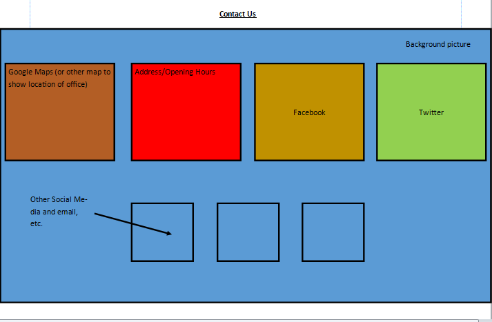
For the contact us page, I have moved the address and text details onto the bottom of the webpage, and the social media links onto the right side while making them vertically aligned. In addition, the boxes for the Google Maps widget and the text details have been enlarged. I think this design is a better use of space for my client, but could look clustered.