Thursday, November 27, 2014

Nov 27 - Modifying the homepage

After consulting with my client on how I can improve my website, I changed my website according to what we agreed on. Here is what I changed, and how it affected the website:

The first thing I changed, was the transition times for the drop-down menu bar. It was set on the "* :before, :after" rule in CSS. In order to create different transition times for each transition in the website, I moved the 'transition-duration'  to each one that needs a transition time. This would mean that if I were to collectively change the transition time, for each transition I would need to do more actions, but this would also allow me to have a different transition duration for each transition. Two examples of rules containing the 'transition-duration' are shown below:


       I also changed the color for the website drop-down navigation bar. Aside from changing the drop-down menu transition time to have a longer duration, the menu bar would also change color when it is hovered. It used to only change the border of the navigation bar, but it now changes the color of the navigation bar as a whole. Here is what the code looks like now:


Using this, it changes the navigation bar to red when I hover over it, gradually over 1 second.


The border-radius was added here, so that I can improve the visual appeal. I will follow up with my client later to see if she approves with this. I also removed the box-shadows, since it doesn't look minimalist and I believe it looks better when I removed it.


Another thing I changed was the animation when I clicked on/hovered on an item. In this example, I changed the radio buttons, so that when I click on them their color (or to be exact, their opacity) would change. It used to change the position by 'margin-top'  set to a negative PX, but I think this increases the visual appeal and will look more minimalist.

Here is what the website looked without modifying it (the picture in the slideshow was from the tutorial that I used to create this slideshow):

And this is the result after modification:


I will start working on the final part of the homepage next lesson, and also follow up with my client on the progress of our website.


Monday, November 24, 2014

Nov 24 - Modifying the Homepage (Discussion)

After contacting my client, we have come to an agreement on what we should do to change the website. Here are screenshots of what we came up with:


To improve our website, I am going to change the glowing border, logo, and transition time for the drop-down menu. In the slideshow, I am going to remove the box shadows and other relevant transitions that will make it minimalist. For the background of the homepage, I might change it to either a color. or a design picture my client has sent me. This modification was developed by me and my client, and we mutually agree on this. We agreed on this because it fits in with the objective that we formed before we started to create the website (to create a visually appealing website), and it helps us to meet that objective.

Friday, November 21, 2014

Nov 21 - Creating the HTML Slideshow

I have been looking at the code for the CSS html slideshow, so that I can understand the code and modify the code and change it to me and my client's preference. These are the main parts of the code which create the slideshow:

At the start of the css document, there is a "@font-face" rule which allows non web safe fonts to be used. The tutorial I followed used a font called "WebSymbols", with a source font in it. The tutorial also uses "@import" to import an url of fonts, from google, which will result in a font that isn't installed on the computer to be used.

The code which applies to "Slideshow-wrap", is used for everything in the css slideshow. In this section, it generally customizes the wrapper, and the size of the box. 'display: block' allows this css to be on its on separate line, so it won't be placed on the same line as another part of the website (for example, the navigation bar, which would cluster the website, rendering it impractical and not functional. The height is set as 320px, with the minimum/maximum width set as 260 to 640 px, depending on the monitor/resolution of the user. The margin is also flexible in case of the user, allowing the browser to calculate it. The border used is a 12px solid black border.There is also a 'box-shadow' added, with '-website-' and '-moz-' used so that the 'box-shadow' will apply to every browser. 'Position' is set to relative, so it can be set at relatively the same as its normal position. However, the 'margin-top' has to be set at 20px since there is a need of a gap between the navigation bar and the css slideshow. 'z-index' is set at 1, so that this falls behind everything in terms of front to back positioning order.

In the this section of the css code, it excludes the buttons of the slideshow to only include the pictures. This <div> section is set ot fill 100% of the space given for width and height, and the 'background-color' is set to black, so if the picture source isn't found, it will change the background to black. overflow is hidden so that only the selected picture is shown, and the other pictures in the slider that aren't selected won't be shown.

 In the <ul> section of the 'slideshow-inner' <div>, the list-style is none therefore there won't be any bullet points. The 'width' here is set to 500%, as there are 5 pictures that need to be shown. If it were set to 100%, the 5 pictures will be squashed into the width of slideshow, therefore 500% allows the pictures to be spaced evenly, and so that only the picture selected will be shown on the page. 'Overflow: hidden' is added for extra measure, incase the pictures show in the page. I plan on removing this since I don't think this will be needed. The position is set as relative, with the left set as  '0 px'. I don't think I will need this, and I also plan on removing this from the slideshow. The transition of each picture is set here, with the transition time set as 0.8 seconds. The cubic-bezier curve is used in the tutorial, so that the speed of the transititon can be varied. '

In the <li> inside the <ul>, which is contained in 'slideshow-inner', the width is set as 20% here due to the previous 500% attribute of 'width' that was set. The 20% makes sure the pictures will be placed next to each other, and they are fully functional when they flicked through on the arrows, or using the radio buttons. 'float: left' allows them to be placed next to each other. Without this, the scrolling would also not work properly.

This is what allows the radio button selection to work. 'Visibility- hidden' hides the radio button in the picture, so that it will only show on the bottom of the slideshow. I might change the z-index, since I don't think it is needed for this webpage.


This section of css code refers to the arrows on the left/right of the slideshow. The different decorations such as opacity, opacity transition, cursor change, is included here. The display is set to 'none' in this, because the arrows are invisible, but will be revealed depending on whichever picture is currently selected.

This code reveals the arrows, since it over-rides the 'none' to become 'block'. The bottom section of the code uses 'transform', since it needs to flip the '>' using "ScaleX" to flip it since the arrow will need to point the other direction for the left side.

These are the most important parts of the CSS code which creates the html slideshow. The next thing I will do, is discuss with my client on what I should do to modify the navigation bar and the css slideshow, so that it will be better suited for my client's company.

Tuesday, November 18, 2014

Nov 18 - HTML/CSS Slideshow

After creating the menu bar for my website, I now need to create the picture slideshow on our (me and my client's) website. At first, I was unsure on how to create the interactive picture slideshow. There were 2 options that I could choose from: using JavaScript in the html document, or using CSS to create the slideshow. After some research, I decided to use the CSS option since I was most familiar with this option, compared to using JavaScript. I found this tutorial (http://cssdeck.com/labs/css3-image-slider) that helped me to create my CSS slideshow for me and my client's website. Looking at the code, I figured out how to structure my CSS Slideshow. On the HTML section of the CSS Slideshow, I had to add a section of code which would lay out the tools needed to shape the slideshow:

The <div> on the top, slideshow-wrap, is the wrapper which contains everything inside the slideshow. The different buttons are radio buttons, which are unique because they would uncheck each other if one is selected. They are inside <label> tags to allow them to be labelled. The arrows on the bottom, are arrows which will be placed on each side of the picture, allowing the user to flick through the next/previous pictures. This tutorial uses ">"  as arrows, since it is the simplest option in HTML because they resemble arrows.

In the next part of this website, the <div> tags with the id "slideshow-inner" contain the different pictures which is set in an unordered list format. Each picture is a list item, which contains the image source (I haven't changed the image, since I prefer to use the pictures from the original tutorial which would allow me to easily compare the things I have done right/wrong in my code. There is also a checkbox, which is used to switch between pictures. When it is checked it will move the picture to the item. The checkbox synchronises with the arrows, so the indication on the checkbox radio buttons will change if the user uses the arrow to change picture, or simply clicks on the radio buttons to change the picture. I have yet to add something in to the slideshow_text, as it was modified from the original (description_text) and I would need to discuss with my client on what to write in there. There are 5 different pictures, and the structure of each slide is the same, except for the id names (eg. slide2, slide3) and the label "for".

With all the HTML tools added into this, I will start working on my CSS code next lesson, and look at the code in the tutorial at home so that I can change it to the preference of me and my client next lesson.


Friday, November 14, 2014

November 14 - Finishing the Navigation Bar structure

Today, I have completed the general navigation bar structure, by following the video that was mentioned before. Afterwards, I modified some aspects of the code that would improve it specifically for my website.

First of all, I changed the <div> for the navigation bar. In my previous code, it looked like this:
This seemed a bit unnecessary as I would only be having 1 navigation bar per page. Therefore, I shortened it to this in the HTML and the CSS documents:

This would make things simpler and also avoid clustering of code in the document, as less text is used.

The next thing I did, was remove these <ul> (unordered list) and <li> (list item) tags. Again, it was unnecessary since just using the <a> tags was enough to create the navigation bar. Here is the outcome:
Again, this would be alot more visually minimal, while giving the same outcome.

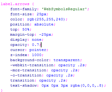
Then, the next thing I changed was the drop-down menus. Here is what it looked like when I followed the video that I used to create the basic structure of my menu bar:
This seems suitable in the html document, but when I go over to the CSS document, everything would be confusing. An example of what I mean is:

As seen here, this tag in the CSS document is used to edit the drop-down menu characteristics, as a whole (the 2nd <ul> in the css document snapshot is the <ul> tag in the html snapshot above). This would be very confusing in the future when I try to edit this website, therefore I had to sort out this problem quickly before it got out of hand. Here was my solution:

As seen here, it would be alot more clear in the CSS document, as to which part of the website a specific CSS code was referring to since they have their own separate names. Here is what it looks like on my CSS document:

This tag would clear the possible confusion that might happen in the future, in case we (me and my client) needed to edit something in the website, as they all have their own separate names to show what they mean.

In the CSS document, other modifications include using rounded edges and adding a border around my menu bar. Here is the code for both modifications:

This is the code for the <nav> tag in CSS. The display is changed to flexbox, and I added a 20px margin to make sure that it doesn't fill up the whole page. The width can change for every monitor with the minimum as 40px, and I changed the background color to black and text to white. The height is 58px, so it doesn't take up the whole page. I then made the text bold so it can be easily seen. The border is 3px, since it would be changed to another color when the mouse pointer hovers over it ,therefore it can't be seen now. The border-radius creates a curved edge around my document, which fits the design plan that me and my client have developed.


This code would chagne the border to an orange color when the mouse hovers over the navigation bar.


I also added an animation, that I believe we (me and my client) will both agree on since the visual appeal of the website is increased. To do so, I used the transition-property tag, as the max-height of the dropdown menu was originally 0px. When I hovered over them, the max-height would change from 0px to 1000px, leading to the dropdown menu showing. This would create the drop-down menu. To also make the transition, I used transition-property to animate it. I did so by animating the max-height function, therefore allowing the smoother transition.
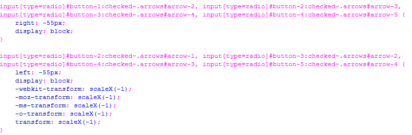
The max-height of the nav-dropdown <div> was changed, so that when the menu bar was not hovered it would not show the other options. The animation was added here by the transition-property as the change in max-height would be animated. The overflow is hidden, since the dropdown menu text shouldn't be visible when the specified menu isn't hovered upon.


This is what causes the menu bar options to show. The max-height changes to 1000px when the selected menu option is hovered upon, therefore showing the different options.

By using :before and :after, the transition-duration can be customized and changed to the liking of the client. It is set as 0.3 seconds for now, but can be changed if we (me and my client) agree that it might be too long or short. The transition-property here is set as none, since nothing else should have the transition apart from the drop-down menu.


Lastly, I also used photoshop to make the logo that was put in the navigation bar. I chose to use this program to design the logo for my client, because it provides various options to create/modify the logo. Through verbal conversation, me and my client decided to use a text logo for the company's webpage. I create the logo using a simple font and placed it as a red color. Here is what the navigation bar looks after completion:

Thursday, November 13, 2014

November 13 - Making the Navigation Bar

Today, I have started to make my website, and I decided to start with the navigation bar. This is because it would be needed for each webpage I create, therefore creating this would lay a base for all my other websites. Using the design that me and my client chose, I first looked at how to create the basic menu bar with a drop-down menu, before I added all the decorations. I was unsure on how to create a drop-down menu with the menu bar, but luckily I found this YouTube video  (https://www.youtube.com/watch?v=PN1iMaVfzfQ) which helped me to create the drop-down menu.
Using this video, I am in the process of making my drop-down menu. The CSS has been linked with my HTML, and I am in the process of adding the drop-down parts of my navigation bar. Here is what is currently looks like now, along with the code:


As you can tell, it is still in progress since the 'design/projects' is on top of the drop-down menu which isn't hidden and aligned properly. Next lesson and at home, I will finish this and update my progress as well.


Friday, November 7, 2014

Nov 7 - Client feedback and suggestions

During this week, Me and my client have been communicating and I have been receiving feedback for our designs. We have been constantly giving suggestions to each other on how we could improve it. Here are the emails that have been sent:
This is the first email that I have sent to show her the designs. She has replied with this to give me her opinions:


Here is the follow-up email she has sent to me, so I can see what I should start making my website on:

Using this information, I am now able to start to make my website with the design in mind. I have started to create me and my client's website and will be able to update my process along the making/testing journey. I will create the webpages I designed first, then conduct a verbal discussion with my client after developing those webpages, on how we should make the other webpages for the website.