Tuesday, November 18, 2014

Nov 18 - HTML/CSS Slideshow

After creating the menu bar for my website, I now need to create the picture slideshow on our (me and my client's) website. At first, I was unsure on how to create the interactive picture slideshow. There were 2 options that I could choose from: using JavaScript in the html document, or using CSS to create the slideshow. After some research, I decided to use the CSS option since I was most familiar with this option, compared to using JavaScript. I found this tutorial (http://cssdeck.com/labs/css3-image-slider) that helped me to create my CSS slideshow for me and my client's website. Looking at the code, I figured out how to structure my CSS Slideshow. On the HTML section of the CSS Slideshow, I had to add a section of code which would lay out the tools needed to shape the slideshow:

The <div> on the top, slideshow-wrap, is the wrapper which contains everything inside the slideshow. The different buttons are radio buttons, which are unique because they would uncheck each other if one is selected. They are inside <label> tags to allow them to be labelled. The arrows on the bottom, are arrows which will be placed on each side of the picture, allowing the user to flick through the next/previous pictures. This tutorial uses ">"  as arrows, since it is the simplest option in HTML because they resemble arrows.

In the next part of this website, the <div> tags with the id "slideshow-inner" contain the different pictures which is set in an unordered list format. Each picture is a list item, which contains the image source (I haven't changed the image, since I prefer to use the pictures from the original tutorial which would allow me to easily compare the things I have done right/wrong in my code. There is also a checkbox, which is used to switch between pictures. When it is checked it will move the picture to the item. The checkbox synchronises with the arrows, so the indication on the checkbox radio buttons will change if the user uses the arrow to change picture, or simply clicks on the radio buttons to change the picture. I have yet to add something in to the slideshow_text, as it was modified from the original (description_text) and I would need to discuss with my client on what to write in there. There are 5 different pictures, and the structure of each slide is the same, except for the id names (eg. slide2, slide3) and the label "for".

With all the HTML tools added into this, I will start working on my CSS code next lesson, and look at the code in the tutorial at home so that I can change it to the preference of me and my client next lesson.


Friday, November 14, 2014

November 14 - Finishing the Navigation Bar structure

Today, I have completed the general navigation bar structure, by following the video that was mentioned before. Afterwards, I modified some aspects of the code that would improve it specifically for my website.

First of all, I changed the <div> for the navigation bar. In my previous code, it looked like this:
This seemed a bit unnecessary as I would only be having 1 navigation bar per page. Therefore, I shortened it to this in the HTML and the CSS documents:

This would make things simpler and also avoid clustering of code in the document, as less text is used.

The next thing I did, was remove these <ul> (unordered list) and <li> (list item) tags. Again, it was unnecessary since just using the <a> tags was enough to create the navigation bar. Here is the outcome:
Again, this would be alot more visually minimal, while giving the same outcome.

Then, the next thing I changed was the drop-down menus. Here is what it looked like when I followed the video that I used to create the basic structure of my menu bar:
This seems suitable in the html document, but when I go over to the CSS document, everything would be confusing. An example of what I mean is:

As seen here, this tag in the CSS document is used to edit the drop-down menu characteristics, as a whole (the 2nd <ul> in the css document snapshot is the <ul> tag in the html snapshot above). This would be very confusing in the future when I try to edit this website, therefore I had to sort out this problem quickly before it got out of hand. Here was my solution:

As seen here, it would be alot more clear in the CSS document, as to which part of the website a specific CSS code was referring to since they have their own separate names. Here is what it looks like on my CSS document:

This tag would clear the possible confusion that might happen in the future, in case we (me and my client) needed to edit something in the website, as they all have their own separate names to show what they mean.

In the CSS document, other modifications include using rounded edges and adding a border around my menu bar. Here is the code for both modifications:

This is the code for the <nav> tag in CSS. The display is changed to flexbox, and I added a 20px margin to make sure that it doesn't fill up the whole page. The width can change for every monitor with the minimum as 40px, and I changed the background color to black and text to white. The height is 58px, so it doesn't take up the whole page. I then made the text bold so it can be easily seen. The border is 3px, since it would be changed to another color when the mouse pointer hovers over it ,therefore it can't be seen now. The border-radius creates a curved edge around my document, which fits the design plan that me and my client have developed.


This code would chagne the border to an orange color when the mouse hovers over the navigation bar.


I also added an animation, that I believe we (me and my client) will both agree on since the visual appeal of the website is increased. To do so, I used the transition-property tag, as the max-height of the dropdown menu was originally 0px. When I hovered over them, the max-height would change from 0px to 1000px, leading to the dropdown menu showing. This would create the drop-down menu. To also make the transition, I used transition-property to animate it. I did so by animating the max-height function, therefore allowing the smoother transition.
The max-height of the nav-dropdown <div> was changed, so that when the menu bar was not hovered it would not show the other options. The animation was added here by the transition-property as the change in max-height would be animated. The overflow is hidden, since the dropdown menu text shouldn't be visible when the specified menu isn't hovered upon.


This is what causes the menu bar options to show. The max-height changes to 1000px when the selected menu option is hovered upon, therefore showing the different options.

By using :before and :after, the transition-duration can be customized and changed to the liking of the client. It is set as 0.3 seconds for now, but can be changed if we (me and my client) agree that it might be too long or short. The transition-property here is set as none, since nothing else should have the transition apart from the drop-down menu.


Lastly, I also used photoshop to make the logo that was put in the navigation bar. I chose to use this program to design the logo for my client, because it provides various options to create/modify the logo. Through verbal conversation, me and my client decided to use a text logo for the company's webpage. I create the logo using a simple font and placed it as a red color. Here is what the navigation bar looks after completion:

Thursday, November 13, 2014

November 13 - Making the Navigation Bar

Today, I have started to make my website, and I decided to start with the navigation bar. This is because it would be needed for each webpage I create, therefore creating this would lay a base for all my other websites. Using the design that me and my client chose, I first looked at how to create the basic menu bar with a drop-down menu, before I added all the decorations. I was unsure on how to create a drop-down menu with the menu bar, but luckily I found this YouTube video  (https://www.youtube.com/watch?v=PN1iMaVfzfQ) which helped me to create the drop-down menu.
Using this video, I am in the process of making my drop-down menu. The CSS has been linked with my HTML, and I am in the process of adding the drop-down parts of my navigation bar. Here is what is currently looks like now, along with the code:


As you can tell, it is still in progress since the 'design/projects' is on top of the drop-down menu which isn't hidden and aligned properly. Next lesson and at home, I will finish this and update my progress as well.


Friday, November 7, 2014

Nov 7 - Client feedback and suggestions

During this week, Me and my client have been communicating and I have been receiving feedback for our designs. We have been constantly giving suggestions to each other on how we could improve it. Here are the emails that have been sent:
This is the first email that I have sent to show her the designs. She has replied with this to give me her opinions:


Here is the follow-up email she has sent to me, so I can see what I should start making my website on:

Using this information, I am now able to start to make my website with the design in mind. I have started to create me and my client's website and will be able to update my process along the making/testing journey. I will create the webpages I designed first, then conduct a verbal discussion with my client after developing those webpages, on how we should make the other webpages for the website.

Friday, October 24, 2014

Oct 24 - Design Making #4

Due to CAS Week, I have not been able to complete my final design. However, over half-term, I have started to create my final design and complete it:

In this design, I used the horizontal menu bar and also used a scrolling design for the main articles (along with less important ones at the bottom). The use of this would provide more space for different articles, but however, this could mean that some articles might be missed by the user if they do not scroll onto all of them. This design provides much flexibility out of all since more articles can be added or removed.


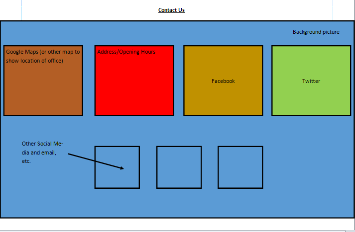
For the contact us page, I decided to make 4 equal boxes for 2 social media widgets, 1 Google Maps widget, and 1 for text details of the office. The 3 mini transparent boxes are for social media website links, without widgets. I think this design is a more simple, organised design compared to the other ones.

Thursday, October 9, 2014

Oct 9 - Design Making #3


My third design has been completed for my client, and I have made many visual changes to this design:

For the homepage, I have moved the menu bar to a horizontal position, and instead gave it 5 main articles for the homepage. I used the Comodo Design webpage as inspiration for the menu bar, as it could be a better option for my client. The 5 articles have been made so that efficient use of space can be achieved if there is not much text to show for them. The 2 articles that are on the left are bigger so that the important info can be easily shown on there. The 3 articles on the right are smaller as less important information can be shown there.
The contact us page for this design is a mix of the first and second designs, which shows efficient use of space while lacking visual appeal. The social media links have been aligned horizontally on the right, while the text details for the office and the Google Maps widget have been elongated.

Thursday, October 2, 2014

Oct 2 - Design Making #2

Today, I have finished the second website design idea for my client's company. This design provides slight changes to my first design in some aspects such as the menu bar, but also some major changes in other areas:
For this design, I changed the horizontal menu bar to cover the whole top part of the screen, and was also moved the logo on top as well. I think this might provide a variety of designs, and my client can use some aspects of each design that she prefers into a final design. Also, I made the main articles on the homepage to be bigger, so that it can provide more detailed information in return for less articles. The colored boxes on the left are for the picture, while the transparent boxes on the right are for the text. Depending on my client's preference, she might use this design if she believes that her website will not need 3 different articles on the homepage.


For the contact us page, I have moved the address and text details onto the bottom of the webpage, and the social media links onto the right side while making them vertically aligned. In addition, the boxes for the Google Maps widget and the text details have been enlarged. I think this design is a better use of space for my client, but could look clustered.