Monday, December 15, 2014

Dec 15 - Website Modification

After deducing what I needed to change on the homepage, I contacted my client for confirmation on what she agreed on my opinions for what to change in the homepage, and other suggestions she might like to add so that we can make our website more visually appealing and meet our objective. From my research, we got to the conclusions that we should provide more emphasis on the logo, use better color schemes, and have larger size pictures on webpages. I provided these suggestions to my client so that we can form some targets for improving our website that meet the criteria. By doing so, we can improve the visual appeal for the website and further achieve the objective that me and my client are trying to reach with this website, and allow for a better access and view of information and images from my client's company.

First of all, we needed to change the logo. Me and my client had another verbal discussion, and we came to the conclusion that creating a vector image for the logo would be better, to avoid pixelation of logo. Apart from just using text, we came to a conclusion that making a simple circular logo would also suitable.

To create the logo, we used this photoshop logo tutorial https://www.youtube.com/watch?v=JznIqTDEawo as inspiration.

Using the 3-circle design to create ring inside the logo, me and my client liked the design and decided to use it as inspiration. We also thought that the font used (dodger condensed) was very modern and stylish. Therefore, we made our logo using this design and font in the video.


To start working on the logo, we used a program called "Xara Photo & Graphic Designer 9" which designs a vector image.

Using the ellipse tool in this program, I created 3 circles of different sizes, and aligned each circle center. The outside and inside circles are black, while the one between both black circles are grey, creating a grey ring inside the circles. Then, I used the text tool to create the text using dodger condensed font for the initials inside the logo and words alongside the logo. Then I exported the file as a PNG file. We then used this logo to create a favicon logo. We used http://www.favicon-generator.org/ to create the favicon logo. The logo was a cropped version that only contains the circular part of the one made using photoshop,

This logo simply turns the picture into an ".ico" file, with 16x16 pixel dimensions. Afterwards, I saved it in the root directory of my website and added the following inside the <head> of each webpage: <link rel="shortcut icon" href="favicon.ico" type="image/x-icon">
<link rel="icon" href="favicon.ico" type="image/x-icon">


After creating the logo, we started working on our website color scheme, to improve the visual appeal. I contacted my client via e-mail, and we discussed what the color scheme should be:


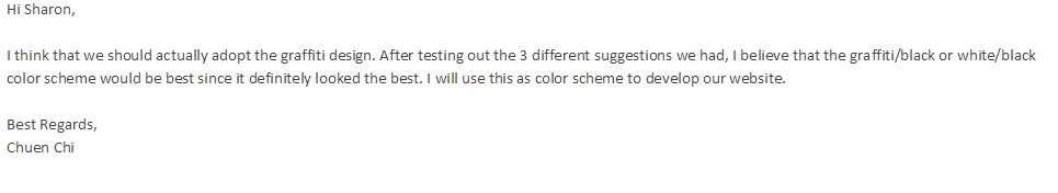
After discussion with my client, we decided that it would be best to use a white/black background or a graffiti/black background, and we will experiment with this on our website.

To experiment with this, I used the homepage as a modification webpage to see how it would look like.

What I changed on the website, was the color scheme, logo, navigation size, and image slider size.

I first changed the logo, and the height of the nav so that it would fit the logo size. I added the logo and changed the nav <div> height attribute, so that the navigation bar would fit the logo size. Here is the html/css code for the navgation (for the parts that I changed):


On the HTML code, I used a different file for the logo and changed the height and width attributes. On the CSS file, I changed the height attribute of the nav section. The navigation hover also turns black after it is hovered on, and it's original color is #333333, which is a grey-black color.


Then for the body in CSS, I changed the 'background-color' attribute from grey to white. Here is what the background and navigation bar looks like for now:


The logo has been changed, and the height of the navigation bar has also been increased.

For the photo slideshow, I changed the slideshow dimensions from 320px to 480px (height), and max width from 640px to 960px. This changes the border dimensions for the slideshow. Then, I changed the image height and width of the images in the slideshow, to 480px height and width 960px. Here is what the website now looks like:


The size of the navigation bar and the image gallery have been increased, and the background has now been changed to white. I will experiment with a graffiti background next time.

Friday, December 12, 2014

Dec 12 - Website Evaluation

Today, we evaluated everyone's websites and projects that each person has done. Victor, Qasim and I were in a group. We evaluated each other's websites.

For my website, the people in my group gave me feedback on how I could improve the website. They said that they thought the website was too plain, and looked very 'generic'. They understood that I was trying to create a minimalist website, but they suggested to use a contrast of black and white to create diversity and avoid giving it a boring look, while keeping the minimalist feel. They also suggested me to reference other minimalist sites, and see how they keep the visual appeal of the site while making it minimalist. A website they suggested me to look at was http://www.lp-architects.com/. This website used a mixture of black and white to show minimalism while making the website look good.

An example from this website that shows good use of color, is the homepage.

The website uses a blend of grey, white and black to create a variation of colors. The logo is also quite big in the website, allowing the user to easily see which website this belongs to.


I also did further research to look at common characteristics of different interior design companies that are similar to my client's company. Another company website that I found was http://www.fancydesign.com.hk/.
This website also shows the use of black and white contrast, as seen by the monochromatic theme in the website. The website logo text is again placed at the top and is of a large size, allowing the viewer and user of the website to easily know which company is using the website. Everything is spaced out neatly and uses up as much space as possible. This is a common characteristic of the websites and I see that often the pictures are the main part of the webpage, showing off the different designs of the company, Fancy Design.

Another webpage I also looked at was http://www.jasdesign.hk/. What I found very interesting was the differences in the website appeal compared to me and my clients website, yet this website uses a similar structure to my site in terms of homepage.

This website again highlights the pictures, and has a bigger picture size compared to my website. The background is white, with grey used for other colors in the background. I found this was interesting because this website uses a similar website structure to me and  my clients website, yet it looks alot more visually appealing. The use of the blend of colors give the website its appealing look.


Using all the information I accumulated from these websites, I see that most of them provide an emphasis on the logo more than I did, use better color schemes, and have larger size pictures on webpages.


I will be contacting my client afterwards, to ask how I could change the color scheme of our website and other point I mentioned in this post in order to increase the visual appeal of our website, using my research.

Wednesday, December 10, 2014

Dec 10 - Site Upload

***WEBSITE LINK: http://www.ultimateconstruction.co.nf***

I managed to upload my website today, using the free website hosting website biz.nf (as I am limited by my client to host this website on a free website hosting site). I chose this website because of the previous research that I have done previously. I found all these websites by doing a google search on free hosting sites (full research can be seen here on http://www.isadumadupad.blogspot.hk/2014/02/feb-17-analysis-and-planning-hosting.html).


This is the homepage of this hosting website. I believe this is the best free hosting site to host on, because it contains no ads, and it also contains a panel that allows me to easily add more files into my website. However due to this hosting website being free, it limits the domain name to only .co.nf and only 250mb of space is allocated to my website. However, 250mb should be more than enough for me and my client's website.


Here is a website hosting site that I also looked at, but didnt choose as I thought biz.nf was a better one. This is because this one, freehostingeu.com, doesn't give as much web space (200 mb). Therefore, I thought biz.nf was a better option and chose that instead.


I then had contact with my client via e-Mail to discuss the details of the webpage:


After confirmation with my client that I should upload my files onto this hosting site, I continued with my process to upload to this website.

After creating my account on this website, I proceeded to create a subdomain on my control panel provided after creating the account. It is accessed using a browser.

Afterwards, I used the file manager (both the domain manager that I used to create a subdomain, and the file manager, is found in the hosting tools in the control panel) to upload files to the website. All files and images are put in the root directory of the domain name. The homepage is set as index.html, so that the hosting site knows which html file is the homepage. The domain name I used is http://www.ultimateconstruction.co.nf/

Afterwards, I tried to access the webpage. Unfortunately to my disappointment, it would give me an error somewhat like this:


I was very confused and frustrated. After consulting my ICT teacher about this. To my relief, I had to wait a while before the website could be successfully accessed.

My website is now complete and ready to be accessed on the internet, therefore I can use this for evaluation with my client and peers. Here is what it looks like on my google chrome browser:


Tuesday, December 9, 2014

Dec 9 - Creating the 'Interior/Exterior' webpage

Today, I created the final page(s) for my website. These 2 webpages are similar, and I therefore used the same style/structure of both websites. I adopted a simple design for the website, using <div> to put each image inside a border, with a description of the image in the border. This code was referenced from a w3schools tutorial (http://www.w3schools.com/css/css_image_gallery.asp) that I found. I decided to use this gallery because of the simple design, as mentioned above. Here is what the webpages look like:

This is the general structure that I use for this website, since it gives a clear box to show the pictures. It also has a description of the picture (usually for the name of the place of design). Here is the HTML code I used for the picture gallery:
I am able to turn the images into links that will enlarge the image as well in another page, apart from having the image in the box itself. I adapted the code by changing the CSS code, such as the color, and display attributes. This changes the style of the gallery that fits the webpage better.

Now that I have finished making all of my webpages, I can upload my webpage onto a hosting website.

Sunday, December 7, 2014

Dec 7 - Making 'About Us' page

After discussing with my client about the about us page and the interior/exterior webpages, we decided to keep these pages as simple as possible by directly showing all the information that is put on the site clearly. For the 'About Us'  webpage, I decided the most effective method would be to add a text box next to some pictures, since this would give a clear understanding to my client's clients on what the company is, and their focus. For the interior and exterior webpages, We believed that an image gallery with links to images would be an extremely good method to store and view pictures on.

I started and finished making the about us page for me and my client's website today. The webpage looks like this:
For the website, I decided to adopt a simple approach and use one side of the webpage as a textbox, and the other side as a display for picture(s). This allows an easier understanding of the company by their clients. Again, this code was creating by scratch using information I learned from http://www.codecademy.com and http://www.w3schools.com. Here is the HTML code of the textbox and picture sections of the webpage:

Using a <h2> inside the green textbox, I added a title, and <p> to be able to add margins which won't interfere with other texts in the page. This also helps me to set the font size. This was all done in the CSS section of this webpage's code:


The padding for the text is set as 10px for each side, with the text aligned as center for <h2>. The top margin for the <p> inside ".text" makes sure the paragraphs won't be jumbled up together, and can be easily differentiated. I am also considering adding a scrolling function to this text box, which I will decide with my client. For the <img>, I set it to have a 50px top margin and a 40px left margin so that it will have space to separate itself from the textbox.

Now that I have finished making my website, I am now able to upload it for testing.


One thing I also changed about the footer, is the text. I now use the sentence "© 2014 Ultimate Construction Engineering Ltd." for my footer.

Friday, December 5, 2014

Dec 5 - Making 'Contact Us' webpage

Today, I started to make the 'Contact Us' webpage.

Firstly, I added a footer to the homepage, since this footer will be included in every webpage. Using the 'margin-top'  css style, I would separate it from the other parts of the webpage by giving it its own space so the user won't be confused as to what it is. Here is what the footer looks like on the homepage:
For the contact us page, I first started to work on the social media buttons.My client decided to make some social media websites for her company along with the website itself, since it would give even more pathways for her clients to easily access information. To create this, I found the social media buttons on icon finder, and using the information I learnt from http://www.w3schools.com/ and http://www.codecademy.com/, I put the different pictures aligned in the way I designed them in my plan.

In order to do this, I decided to set their position to absolute. By doing so, I can easily move them to right side of the webpage without affecting other parts of the webpage. Here is the code for it:

Using flexbox, I placed the social media buttons in a column order. 'Position:absolute' would move the social images onto the right side without affecting other parts of this webpage. By using "right: 20px', I moved it near to the right side, but not to the extremely far end because I needed to leave some space between the edge and the social media buttons. The same goes for the 'top:100px' since I have to leave space for the edge and the nav bar.

One thing I changed for the ".social" was the "transition-duration" attribute. Instead of putting it in ".social > img", I moved it to ".social" so that the transition duration will apply not only when the button/image is hovered on, but also after the mouse stops hovering on the button/image. This allows for a smoother animation and transition. My Client suggested this after I showed her the webpage when we were still developing it. After realizing this, we decided to adopt this on other parts of the webpage, such as the navigation bar, and also parts of the homepage that has the "transition-duration" attribute.

After creating that, I made the google maps iframe for me and my clients website. After googling, I decided to first use this tutorial https://developers.google.com/maps/tutorials/fundamentals/adding-a-google-map by google themselves. However, the code they used for this iframe was not as good as one I found on http://www.xavainteriors.hk/contact.html since it didn't give as much information on the UI. Here are 2 pictures in comparison to the google maps tutorial from google:

And a picture of the google maps iframe I found on the Xava interiors website:

As you can see, the second one provides a pin, and the address is also listed on screen. The iframe also supports the locations that the user pinpointed on their google account map, giving a more convenient access to different locations on the map. In order to do this, I referenced the code found on the Xava Interiors website. Then, I went on google maps website to get an embed link from google maps for my client's address, then I put that into an iframe by setting it as its source. Here is what the code looks like:

I put the <iframe> in its own <div>, and set the height and width of the <iframe>. Inside the <iframe> tags, I added a message that would appear if the <iframe> was not supported by the users web browser. I also used a css code to customize the <div>, and I gave the google maps a border. The border was more or less the same style as the previous borders used in the website, since I believe my client would want to keep it the same as before, inheriting the same style and feel to every webpage inside the website. I edited the iframe such as width and height, so it would fit my webpage.

Finally, in order to complete this contact us page, I added a text box on the right side of the google maps. This was first created by adding a <div> for this text box, and using paragraphs (<p>)  to separate the text. Because my client and I decided to add clickable email and telephone links into the text box, we used "href:tel" or "href:mailto" to set the different email and telephone links.
Above is a picture of the HTML code for the text box section. Below is the CSS code for the textbox. The background is currently set as red for the textbox, for my client to easily differentiate which is what. I will consult with my client after the basic structure and featuires of the website is completed, to make sure that the color schemes fit elegantly for the website.
In ".tel1" and the ".tel1:active" sections, The color is set as blue when ".tel1" isn't clicked on. When clicked on, ".tel1" will turn blue after a transition duration of 0.2 seconds. The same goes for ".tel2", ".tel2:active", and ".mailto" ".mailto:active" which is not shown in this snapshot of the code, since I felt it was unneccescary as it basically contained the same things as ".tel1" and ".tel1:active".

Finally, for the footer CSS code in this webpage, I had to use "position:absolute" to make sure it doesn't interfere with the webpage. Here is what the code looks like for the footer CSS:


Here is the contact us page now, after I have completed its structure:


Next lesson and at home, I will start working on the other pages in this webpage. I will conduct a verbal discussion with my client after showing her our webpages that have been completed, and then create the remaining webpages from our agreement.

Tuesday, December 2, 2014

Dec 2 - Finalizing the homepage + follow-up with client

Today. I have finished creating/editing the homepage, and followed up with my client on the progress, so that we can give each other mutual feedback and opinions on the homepage.

For the logo color, I decided to change that after it has been evaluated by my peers, teachers and client, so that I can put all my major website changes into one whole post, However, hover color of the website nav bar was changed by me after me and my client discussed this so that it looks better.

After completing the modification from feedback from both me and my client, I made the clickable images that are placed underneath the css slideshow. Here is what it looks like:


I am currently using placeholder images in the website. since I have yet to customize the images my client sent me to fit nicely in these 3 boxes. They are image links that will bring the website user to the selected project shown in the image. I have not configured the color scheme of the border since I decided to let this be the decision of my client. I also will follow up with my client on whether if I should add a text description underneath each image link.

After completing the homepage structure, I contacted my client on my next steps for improving the website. Here are some screenshots
of our conversation:

To finish the homepage, I decided against adding text to the images since more text would make the website less minimalist. I also changed the website image link borders to black. Here is the html/css code for the image link now, along with the website look:

I also realized that there is a mini empty space between the bottom border area and the image itself. I will need to see what caused this and fix this next lesson.
Apart from fixing the border next lesson, I will also start working on the contact us page.