Firstly, I added a footer to the homepage, since this footer will be included in every webpage. Using the 'margin-top' css style, I would separate it from the other parts of the webpage by giving it its own space so the user won't be confused as to what it is. Here is what the footer looks like on the homepage:

In order to do this, I decided to set their position to absolute. By doing so, I can easily move them to right side of the webpage without affecting other parts of the webpage. Here is the code for it:
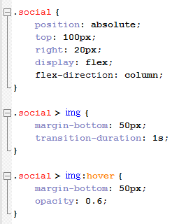

Using flexbox, I placed the social media buttons in a column order. 'Position:absolute' would move the social images onto the right side without affecting other parts of this webpage. By using "right: 20px', I moved it near to the right side, but not to the extremely far end because I needed to leave some space between the edge and the social media buttons. The same goes for the 'top:100px' since I have to leave space for the edge and the nav bar.
One thing I changed for the ".social" was the "transition-duration" attribute. Instead of putting it in ".social > img", I moved it to ".social" so that the transition duration will apply not only when the button/image is hovered on, but also after the mouse stops hovering on the button/image. This allows for a smoother animation and transition. My Client suggested this after I showed her the webpage when we were still developing it. After realizing this, we decided to adopt this on other parts of the webpage, such as the navigation bar, and also parts of the homepage that has the "transition-duration" attribute.
One thing I changed for the ".social" was the "transition-duration" attribute. Instead of putting it in ".social > img", I moved it to ".social" so that the transition duration will apply not only when the button/image is hovered on, but also after the mouse stops hovering on the button/image. This allows for a smoother animation and transition. My Client suggested this after I showed her the webpage when we were still developing it. After realizing this, we decided to adopt this on other parts of the webpage, such as the navigation bar, and also parts of the homepage that has the "transition-duration" attribute.
After creating that, I made the google maps iframe for me and my clients website. After googling, I decided to first use this tutorial https://developers.google.com/maps/tutorials/fundamentals/adding-a-google-map by google themselves. However, the code they used for this iframe was not as good as one I found on http://www.xavainteriors.hk/contact.html since it didn't give as much information on the UI. Here are 2 pictures in comparison to the google maps tutorial from google:


And a picture of the google maps iframe I found on the Xava interiors website:
As you can see, the second one provides a pin, and the address is also listed on screen. The iframe also supports the locations that the user pinpointed on their google account map, giving a more convenient access to different locations on the map. In order to do this, I referenced the code found on the Xava Interiors website. Then, I went on google maps website to get an embed link from google maps for my client's address, then I put that into an iframe by setting it as its source. Here is what the code looks like:

I put the <iframe> in its own <div>, and set the height and width of the <iframe>. Inside the <iframe> tags, I added a message that would appear if the <iframe> was not supported by the users web browser. I also used a css code to customize the <div>, and I gave the google maps a border. The border was more or less the same style as the previous borders used in the website, since I believe my client would want to keep it the same as before, inheriting the same style and feel to every webpage inside the website. I edited the iframe such as width and height, so it would fit my webpage.
Finally, in order to complete this contact us page, I added a text box on the right side of the google maps. This was first created by adding a <div> for this text box, and using paragraphs (<p>) to separate the text. Because my client and I decided to add clickable email and telephone links into the text box, we used "href:tel" or "href:mailto" to set the different email and telephone links.

Above is a picture of the HTML code for the text box section. Below is the CSS code for the textbox. The background is currently set as red for the textbox, for my client to easily differentiate which is what. I will consult with my client after the basic structure and featuires of the website is completed, to make sure that the color schemes fit elegantly for the website.

In ".tel1" and the ".tel1:active" sections, The color is set as blue when ".tel1" isn't clicked on. When clicked on, ".tel1" will turn blue after a transition duration of 0.2 seconds. The same goes for ".tel2", ".tel2:active", and ".mailto" ".mailto:active" which is not shown in this snapshot of the code, since I felt it was unneccescary as it basically contained the same things as ".tel1" and ".tel1:active".
Finally, for the footer CSS code in this webpage, I had to use "position:absolute" to make sure it doesn't interfere with the webpage. Here is what the code looks like for the footer CSS:

Here is the contact us page now, after I have completed its structure:

Next lesson and at home, I will start working on the other pages in this webpage. I will conduct a verbal discussion with my client after showing her our webpages that have been completed, and then create the remaining webpages from our agreement.
No comments:
Post a Comment