Friday, November 7, 2014

Nov 7 - Client feedback and suggestions

During this week, Me and my client have been communicating and I have been receiving feedback for our designs. We have been constantly giving suggestions to each other on how we could improve it. Here are the emails that have been sent:
This is the first email that I have sent to show her the designs. She has replied with this to give me her opinions:


Here is the follow-up email she has sent to me, so I can see what I should start making my website on:

Using this information, I am now able to start to make my website with the design in mind. I have started to create me and my client's website and will be able to update my process along the making/testing journey. I will create the webpages I designed first, then conduct a verbal discussion with my client after developing those webpages, on how we should make the other webpages for the website.

Friday, October 24, 2014

Oct 24 - Design Making #4

Due to CAS Week, I have not been able to complete my final design. However, over half-term, I have started to create my final design and complete it:

In this design, I used the horizontal menu bar and also used a scrolling design for the main articles (along with less important ones at the bottom). The use of this would provide more space for different articles, but however, this could mean that some articles might be missed by the user if they do not scroll onto all of them. This design provides much flexibility out of all since more articles can be added or removed.


For the contact us page, I decided to make 4 equal boxes for 2 social media widgets, 1 Google Maps widget, and 1 for text details of the office. The 3 mini transparent boxes are for social media website links, without widgets. I think this design is a more simple, organised design compared to the other ones.

Thursday, October 9, 2014

Oct 9 - Design Making #3


My third design has been completed for my client, and I have made many visual changes to this design:

For the homepage, I have moved the menu bar to a horizontal position, and instead gave it 5 main articles for the homepage. I used the Comodo Design webpage as inspiration for the menu bar, as it could be a better option for my client. The 5 articles have been made so that efficient use of space can be achieved if there is not much text to show for them. The 2 articles that are on the left are bigger so that the important info can be easily shown on there. The 3 articles on the right are smaller as less important information can be shown there.
The contact us page for this design is a mix of the first and second designs, which shows efficient use of space while lacking visual appeal. The social media links have been aligned horizontally on the right, while the text details for the office and the Google Maps widget have been elongated.

Thursday, October 2, 2014

Oct 2 - Design Making #2

Today, I have finished the second website design idea for my client's company. This design provides slight changes to my first design in some aspects such as the menu bar, but also some major changes in other areas:
For this design, I changed the horizontal menu bar to cover the whole top part of the screen, and was also moved the logo on top as well. I think this might provide a variety of designs, and my client can use some aspects of each design that she prefers into a final design. Also, I made the main articles on the homepage to be bigger, so that it can provide more detailed information in return for less articles. The colored boxes on the left are for the picture, while the transparent boxes on the right are for the text. Depending on my client's preference, she might use this design if she believes that her website will not need 3 different articles on the homepage.


For the contact us page, I have moved the address and text details onto the bottom of the webpage, and the social media links onto the right side while making them vertically aligned. In addition, the boxes for the Google Maps widget and the text details have been enlarged. I think this design is a better use of space for my client, but could look clustered.

Friday, September 26, 2014

Sep 26 - Design Making

In the current lessons, I have been creating designs for my client. I plan to create around 4-5 designs before I send to my client to evaluate, so that she can review all of them and pick out different parts of each that she prefers to include. I have used the objectives and success criteria that me and my client have developed together. The program I used to create these designs are Microsoft Publisher, since it is easy to create shapes for the website template. I could have used another program such as Photoshop, but my client would only be able to view these designs and not edit them since she doesn't have Photoshop installed (only view them because I can export as an image file).

The color schemes can be easily changed, and the contrasting colors in these designs are just to separate each section without confusion. Here is the first design that I have finished creating:

For the homepage, I have decided to create a horizontal menu bar that sits on top of the page. There will be drop down menus when needed for some selections, that will appear when hovered upon. The 3 main boxes in the middle of the page are for the important, or most recent updates to the site. There is a background picture for this that can be chosen, or instead a slideshow of pictures if my client wants that. The menu bar on the top was inspired by looking at the Nestle website that I put on my research, with a little modification to it.


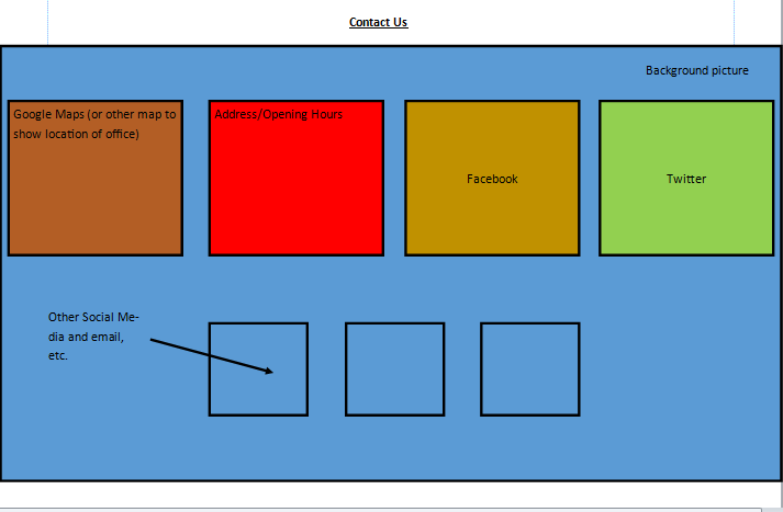
I decided to design the 'Contact Us' page, since this can be used to base other sections of the website upon as it provides a theme and style that other sections can use. Also, this webpage gives information about the company to the clients, which is included in my objectives and success criteria. The main section is for a Google Maps widget that can display the location of the office of my client, and the smaller box in red shows the different opening hours, address in text, and telephone. The 5 icons that are round on the bottom will direct the user to the social media pages of my client's company, or email. This can be changed by my client to accommodate the different sites she wants to put there. I was inspired by the Xava Interiors website to put the Google Maps widget, as I believe it would help my client's customers to easily reach their office.

Wednesday, September 17, 2014

Sep 17 - Objectives and Success Criteria

Aims
Objectives
Criteria
To create a visually appealing website.
-          Use colours that blend well, and cool colours (such as blue, green, etc.) so that they don’t make everything too bright, or a monochromatic color scheme.
-          Format everything so that the layout isn’t clustered.
-          Survey with other people.
-          Client contact.
-          Ensure everything has an x amount of pixels between different paragraphs/sections.
To give easy access to information about the company.
-          Create a menu bar which gives different sections that can easily be clicked on
-          Make sure it has been used
Provide various information about projects, staff, including inspiration, themes/building size, etc.
-          Use a grid format to show different information about the designers,
-          Use all information provided, include all sections listed in aims.
To provide details on contacting the company (including addresses, email, etc.)
-          Create a separate page that can display all the needed information/information provided.
-          Check if all the information give is put on it.

Wednesday, September 3, 2014

Sep 3 - Client Contact - Developing Project Aims

Via e-Mail, I have been contacting my client the past few days to ensure that the Project Aims are to her benefit and she is satisfied with them. Firstly, I listed some ideas that I think she might want, and she picked out some of the aims from the list, and also listed some additional aims that she would like me to develop on. Here are some screenshots of what we have been discussing:


From contacting my client, I have been able to establish the project aims for the website. They are as follows:


-To create a visually appealing website
-To give easy access to information
-Providing various information about projects and staff, including inspiration, and themes/building size, etc.
-To provide details on contacting the company address, email, etc.

Using these project aims, I will create designs for my client so that we can design a website to our liking, and make sure it fits the aims of our project.